How to Create a Pie Chart
A pie chart is used to show the composition of a whole, divided into parts.
Learn how to create a pie chart in R with ggplot2.
In this tutorial, we’ll learn how to create a pie chart in R using the ggplot2 package. Here’s a brief overview of what we’ll cover:

geom_bar() to create the basic structure of the chart.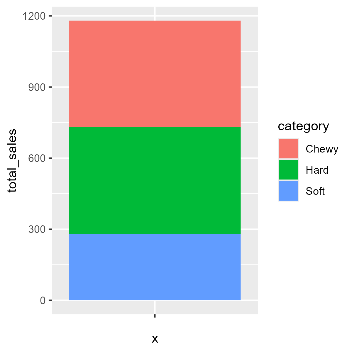
coord_polar() to transform the bar chart into a pie chart.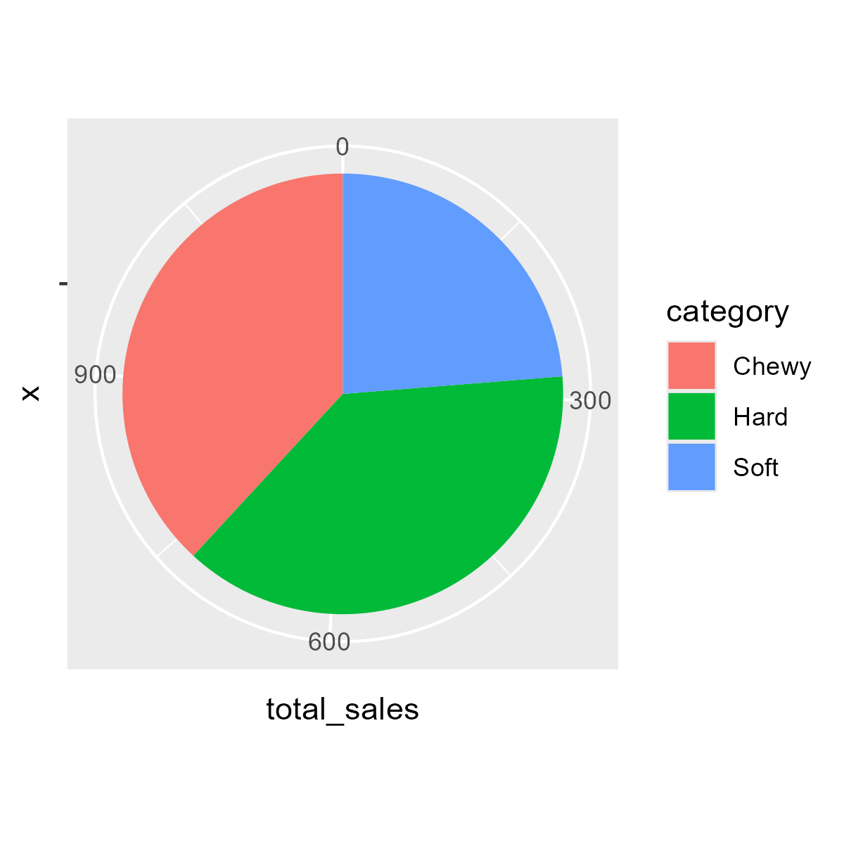
theme_void() to remove unnecessary elements.
labs() to add a title, caption, and alt text.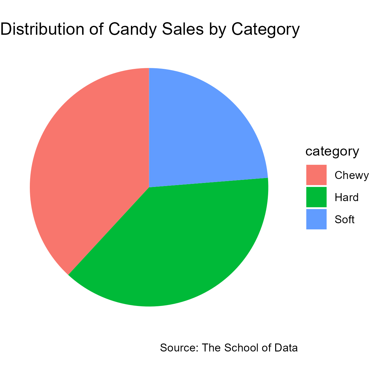
We’ll use the candy dataset throughout this tutorial. Here’s a preview of the data:
| name | sales | price | rating | year | category |
|---|---|---|---|---|---|
| Jelly Beans | 300 | 2.5 | 4.5 | 2019 | Chewy |
| Gummy Bears | 150 | 1.5 | 3.8 | 2020 | Chewy |
| Lollipop | 200 | 1 | 4 | 2021 | Hard |
| Cotton Candy | 100 | 2 | 4.2 | 2022 | Soft |
| Jolly Ranchers | 250 | 1.8 | 4.7 | 2023 | Hard |
| Marshmallow | 180 | 1.2 | 3.5 | 2024 | Soft |
To view the code to create the candy dataset, click the button below:
We’ll create a pie chart that shows the distribution of candy sales by category.
Let’s go through the process of creating this pie chart step by step.
pie_data <- candy |>
group_by(category) |>
summarize(total_sales = sum(sales))
ggplot(pie_data, aes(x = "", y = total_sales, fill = category)) 
ggplot(pie_data, aes(x = "", y = total_sales, fill = category)) +
geom_bar(width = 1, stat = "identity") 
ggplot(pie_data, aes(x = "", y = total_sales, fill = category)) +
geom_bar(width = 1, stat = "identity") +
coord_polar("y", start = 0) 
Try running the code below to see a basic pie chart of candy sales by category:
Now, let’s improve our pie chart by adding more elements and customizing its appearance.
ggplot(pie_data, aes(x = "", y = total_sales, fill = category)) +
geom_bar(width = 1, stat = "identity") +
coord_polar("y", start = 0) +
theme_void() 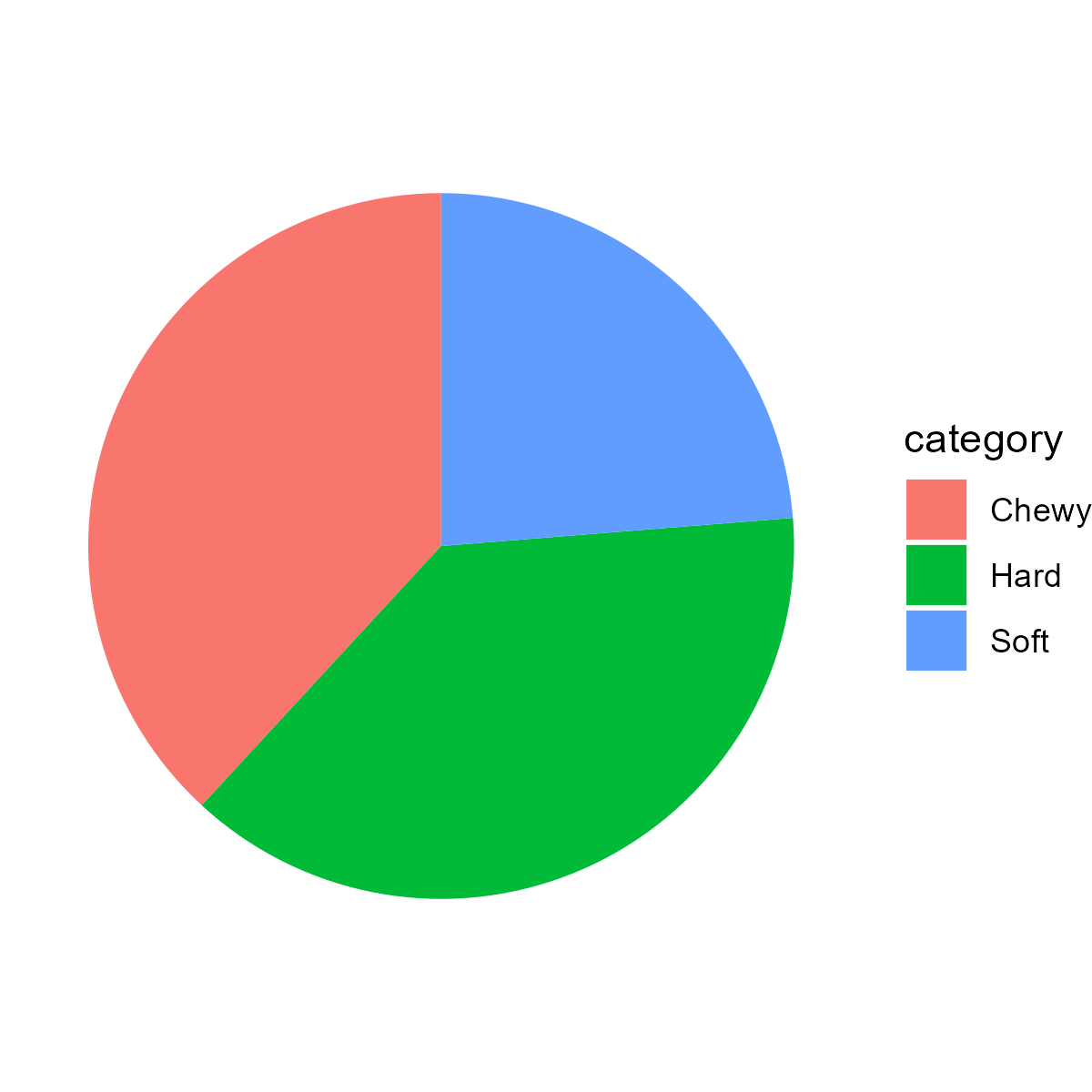
ggplot(pie_data, aes(x = "", y = total_sales, fill = category)) +
geom_bar(width = 1, stat = "identity") +
coord_polar("y", start = 0) +
theme_void() +
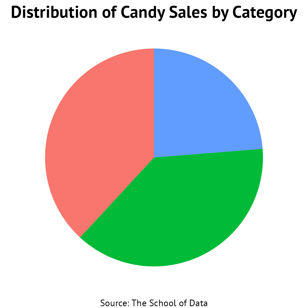
labs(alt = "Pie chart of candy sales by category",
title = "Distribution of Candy Sales by Category",
caption = "Source: The School of Data") 
ggplot(pie_data, aes(x = "", y = total_sales, fill = category)) +
geom_bar(width = 1, stat = "identity") +
coord_polar("y", start = 0) +
theme_void() +
labs(alt = "Pie chart of candy sales by category",
title = "Distribution of Candy Sales by Category",
caption = "Source: The School of Data") +
theme(text = element_text(family = "PT Sans"),
plot.title = element_text(face = "bold", size = 16, hjust = 0.5),
plot.caption = element_text(hjust = 0.5),
legend.position = "none") 
ggplot(pie_data, aes(x = "", y = total_sales, fill = category)) +
geom_bar(width = 1, stat = "identity") +
coord_polar("y", start = 0) +
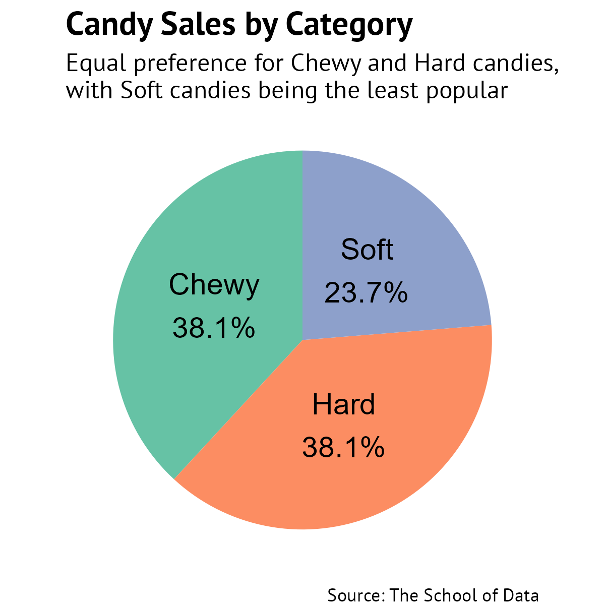
geom_text(aes(label = paste0(category, "\n", round(total_sales / sum(total_sales) * 100, 1), "%")),
position = position_stack(vjust = 0.5),
size = 5) +
theme_void() +
labs(alt = "Pie chart of candy sales by category (Chewy: 37.5%, Hard: 37.5%, Soft: 25%)",
title = "Candy Sales by Category",
subtitle = "Equal preference for Chewy and Hard candies,\nwith Soft candies being the least popular",
caption = "Source: The School of Data") +
theme(text = element_text(family = "PT Sans"),
plot.title = element_text(face = "bold", size = 16),
plot.subtitle = element_text(size = 12),
plot.caption = element_text(hjust = 1),
legend.position = "none") +
scale_fill_brewer(palette = "Set2") Create a pie chart showing the distribution of candy prices. Use the price column instead of sales , and customize the colors using a different color palette.
Loading...
Loading...
Loading...
We’ve learned how to create a pie chart in R using the ggplot2 package. Here’s a summary of the steps we covered:
Step 1: Prepare the data by aggregating the values you want to visualize.
Step 2: Add geometric objects to create the basic structure of the chart.
Step 3: Convert the bar chart to a pie chart using coord_polar() .
Step 4: Remove unnecessary elements like axes and background using theme_void() .
Step 5: Add a title, caption, and alt text using labs() .
Step 6: Customize text appearance and remove the legend.
Step 7: Add labels to the pie slices and improve formatting.
Great work. We’ve created a pie chart with ggplot2.
We’re reaching the end of this course. In the next section, we’ll review what we’ve learned and explore some additional resources to continue your learning journey.