Welcome
Welcome to this course! Data visualization is a crucial part of data analysis. It helps you understand your data, communicate your findings, and make informed decisions. In this course, we will learn how to create data visualizations using ggplot2 in R.
Why ggplot2?
Compared to point and click charting tools, creating plots with code can be a bit intimidating. However, the flexibility and the ability to create plots with code can simplify and reduce the time it takes to create plots. It is also easier to reproduce and customize plots.
Learning ggplot2 can be challenging, but it will be worth it. ggplot2 provides the right balance of creating a variety of plots with the right amount of code and enough to make it as customizable as possible.
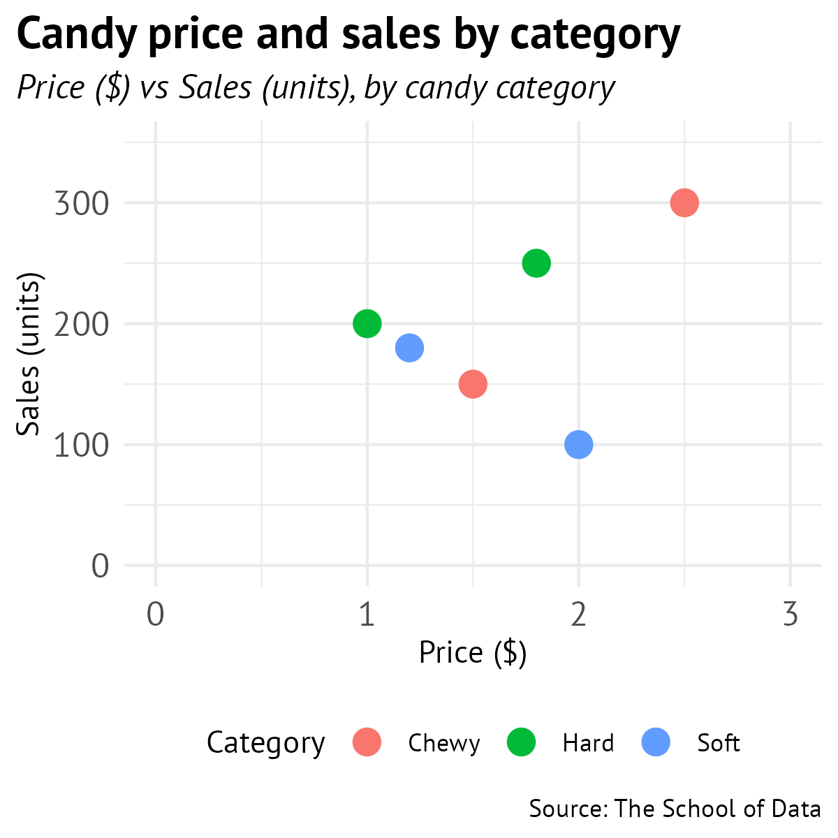
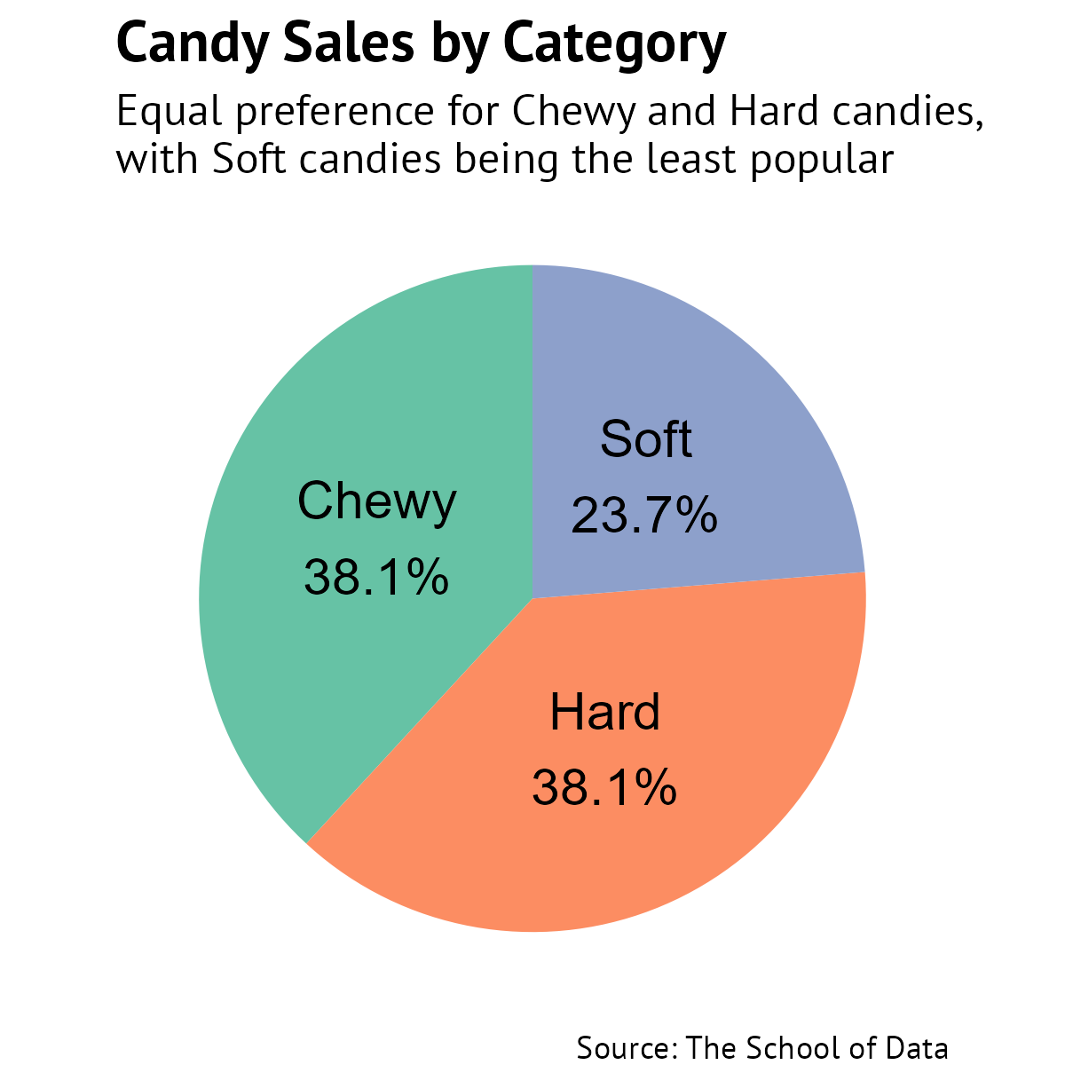
In this course, we’ll create these charts with ggplot2 all with a few lines of code:


Course Overview
- Create a bar chart
- Create a column chart
- Create a line graph
- Create a scatter plot
- Create a pie chart
- Customize scales and axes
- Modify themes and styles
- Learn good practices for data visualization
Installing and loading the ggplot2 package
To install the ggplot2 package, we need to run this code. You only need to do this once on your computer.
install.packages("ggplot2") Now, whenever you are using R and need to use the ggplot2 package, make sure to load the package by adding this line in the beginning and running it.
library(ggplot2) The ggplot2 package also comes installed with the tidyverse set of packages. You can follow the same steps to install and load the tidyverse package.
In the next section, we’ll create a bar chart and learn more about creating visuals with ggplot2 along the way. Let’s get started!
Review
Loading...
Loading...
Loading...