How to Create a Scatter Plot
A scatter plot is used to visualize the relationship between two numerical variables.
Learn how to create a scatter plot in R with ggplot2.
In this tutorial, we’ll learn how to create a scatter plot in R using the ggplot2 package. Here’s a brief overview of what we’ll cover:
ggplot function and specify the data frame.
aes function to map the variables (x and y axes).
geom_point() to create the scatter plot.

We’ll use the candy dataset throughout this tutorial. Here’s a preview of the data:
| name | sales | price | rating | year | category |
|---|---|---|---|---|---|
| Jelly Beans | 300 | 2.5 | 4.5 | 2019 | Chewy |
| Gummy Bears | 150 | 1.5 | 3.8 | 2020 | Chewy |
| Lollipop | 200 | 1 | 4 | 2021 | Hard |
| Cotton Candy | 100 | 2 | 4.2 | 2022 | Soft |
| Jolly Ranchers | 250 | 1.8 | 4.7 | 2023 | Hard |
| Marshmallow | 180 | 1.2 | 3.5 | 2024 | Soft |
To view the code to create the candy dataset, click the button below:
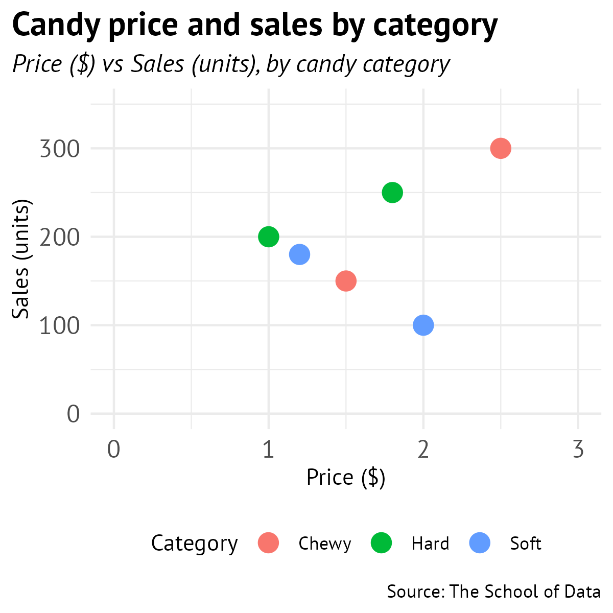
We’ll create a scatter plot that shows the relationship between candy price and sales, with points colored by category.

Let’s go through the process of creating this scatter plot step by step.
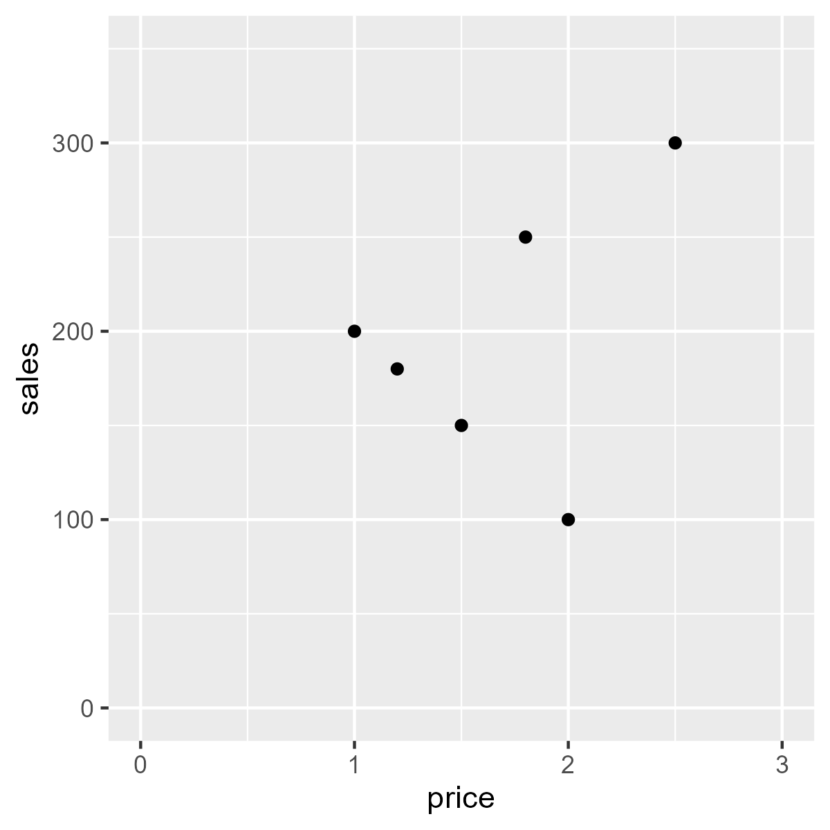
ggplot(data = candy) 
ggplot(data = candy) +
aes(x = price, y = sales) 
ggplot(data = candy) +
aes(x = price, y = sales) +
geom_point() 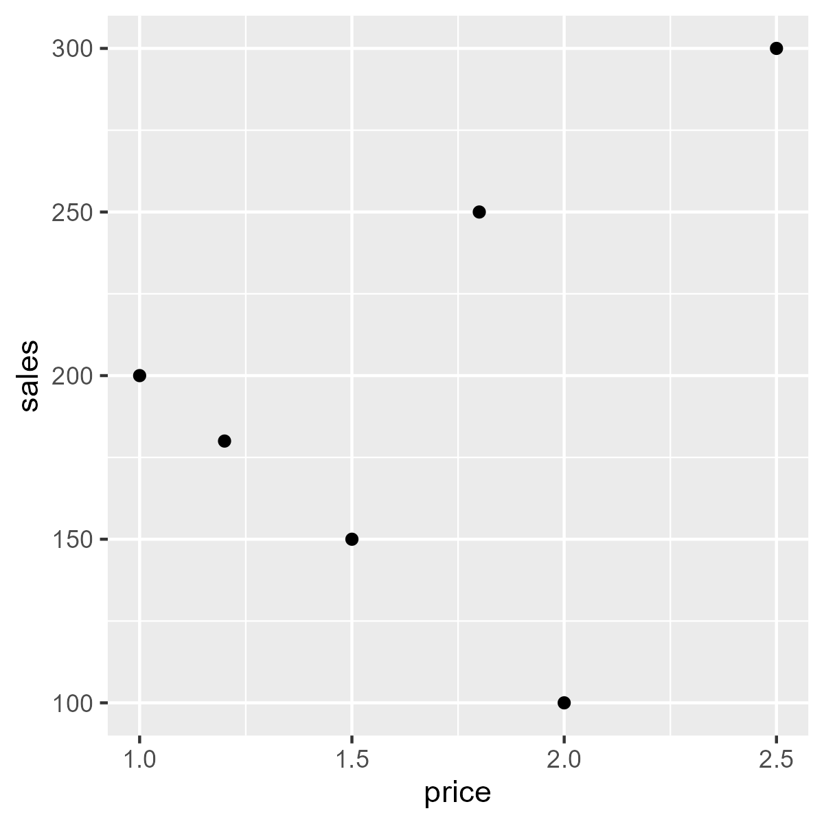
Try running the code below to see a scatter plot of candy price vs sales:
Change the x-axis to rating and the y-axis to price .
Now, let’s improve our scatter plot by adding more elements and customizing its appearance.
ggplot(candy) +
aes(x = price, y = sales) +
geom_point() +
scale_x_continuous(limits = c(0, 3)) +
scale_y_continuous(limits = c(0, 350)) 
ggplot(candy) +
aes(x = price, y = sales) +
geom_point() +
scale_x_continuous(limits = c(0, 3)) +
scale_y_continuous(limits = c(0, 350)) +
labs(alt = "Scatter plot of candy price vs sales",
title = "Relationship between candy price and sales",
subtitle = "Price ($) vs Sales (units)",
caption = "Source: The School of Data",
x = "Price ($)", y = "Sales (units)") +
theme(plot.title.position = "plot") 
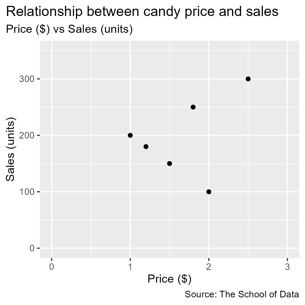
ggplot(candy) +
aes(x = price, y = sales) +
geom_point() +
scale_x_continuous(limits = c(0, 3)) +
scale_y_continuous(limits = c(0, 350)) +
labs(alt = "Scatter plot of candy price vs sales",
title = "Relationship between candy price and sales",
subtitle = "Price ($) vs Sales (units)",
caption = "Source: The School of Data",
x = "Price ($)", y = "Sales (units)") +
theme_minimal() +
theme(text = element_text(family = "PT Sans"),
plot.title.position = "plot",
plot.title = element_text(face = "bold", size = 16),
plot.subtitle = element_text(face = "italic", size = 12),
axis.text = element_text(size = 12)) 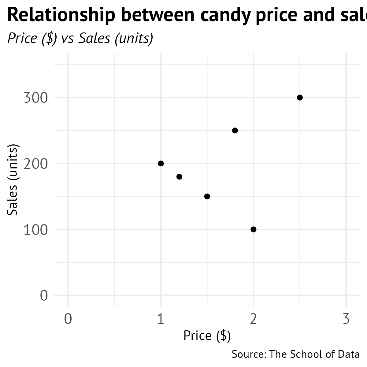
 ggplot(candy) +
  aes(x = price, y = sales, color = category) +
  geom_point(size = 4) +
  scale_x_continuous(limits = c(0, 3)) +
  scale_y_continuous(limits = c(0, 350)) +
  labs(alt = "Scatter plot of candy price vs sales, colored by category",
       title = "Relationship between candy price and sales",
       subtitle = "Price ($) vs Sales (units), by candy category",
       caption = "Source: The School of Data",
       x = "Price ($)", y = "Sales (units)",
       color = "Category") +
   theme_minimal() +
   theme(text = element_text(family = "PT Sans"),
       plot.title.position = "plot",
       plot.caption.position = "plot",
       plot.title = element_text(face = "bold", size = 16),
       plot.subtitle = element_text(face = "italic", size = 12),
       axis.text = element_text(size = 12),
legend.position = "top") Create a scatter plot showing the relationship between rating and sales . Color the points by category and adjust the point size to 3.
Loading...
Loading...
Loading...
We’ve covered the steps to create a scatter plot in R using ggplot2 . Here’s a summary of the key points:
Step 1: Start with the ggplot function and specify the data frame.
Step 2: Add aesthetics using the aes function to map the variables (x and y axes).
Step 3: Add geometric objects with geom_point() to create the scatter plot.
Step 4: Format the axes using scale_x_continuous() and scale_y_continuous() .
Step 5: Add labels and titles with the labs function.
Step 6: Format text and customize the appearance of the plot using the theme function.
Step 7: Customize points by adding color based on a categorical variable and adjusting point size.
Nice! In the next section, we’ll learn how to create a pie chart.